Fonts
I like to think of myself as something of an aesthetically-minded person, or at least that I like pretty things for the sake of them being pretty, not just for what they can do for me.
With that being said, I think picking a nice font for your work is absolutely an intentional choice that you should make. If you are sitting at a desk looking at code all day for work and school, you should do it in a way that both looks good (because this is good for your soul) and which helps you to do your work effectively.
Some people will say "Fonts don't matter" when they talk about, say, their terminal configuration, but I challenge that mentality with the following experiments:
- Set your terminal to use Times New Roman. Do you feel that this is as good of an experience as the default monospaced font? Thus we can demonstrate that spacing matters in a font, and thus font has at least one tangible impact on the quality of your work.
- Set your terminal to use OpenDyslexic or Atkinson Hyperlegible Mono. Does that seem easier or harder to read? At what magnitude? Thus we can demonstrate that shapes matter in a font as well; or at least, it is quite likely that you prefer one or the other of these fonts, and you'd not like to work all day every day with the one you didn't get along with.
Etc. etc.
So overall: I think spending some time to set your tooling to use a font that is conducive to your work is a good use of your time, and here are some of my conclusions from fiddling around with my own setups.
My default: Berkeley Mono
My default font for 90% of things is Berkeley Mono, a paid font from US Graphics. I bought a license for myself as a reward for when I started my first MS and I haven't regretted it for a moment.
The shapes of the font are excellent and it looks extremely much, to me, like
how I imagine that all text in a terminal should look: Boxy and retro without
being distracted. The best thing about it is how little I notice it, except for
that very distinctive @, which is a singular affectation that reinforces how
much I don't notice the font the rest of the time.
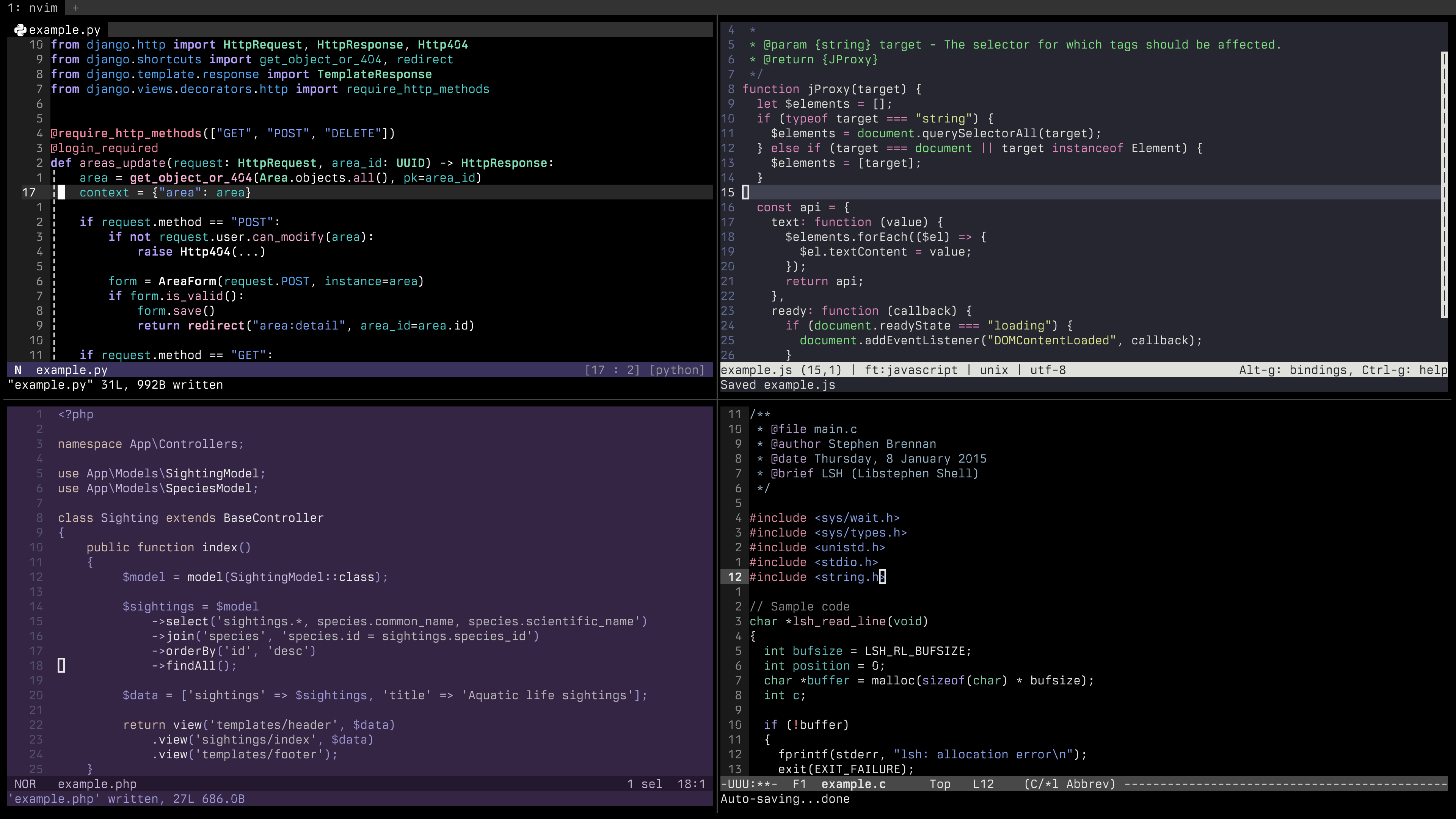
For PHP: 0xProto
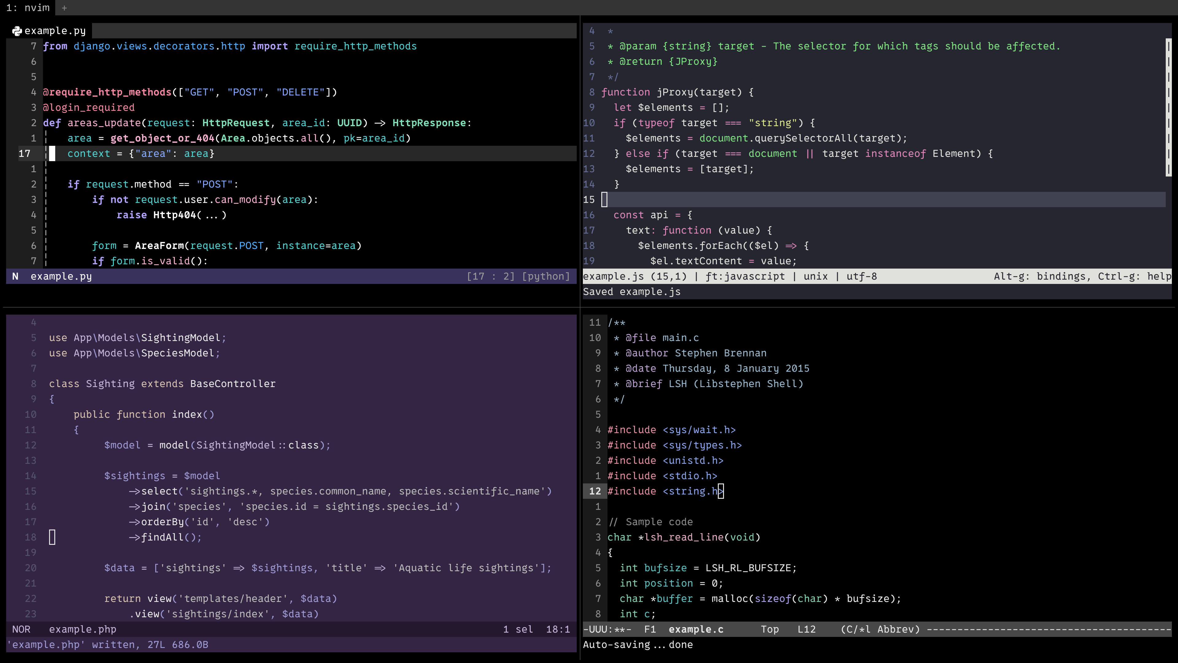
My current job (as of 2026 when I am writing this page) is mostly in PHP, and PHP is notable for a heavy use of code digraphs:
- The arrow accessor
->for instance access, - The double-colon accessor
::for static access, - The fat arrow
=>for associative arrays and thematchkeyword, - The new 8.5 pipe operator
|>, a long-overdue addition to finally finally finally give us an easy way to handle long data transformation pipelines, - The
??and||and&&digraphs and the spaceship operator<=>and the null-safe assignment operator?=and on and on and on.
I'll be completely honest and say that as stupid as it is, the fact that PHP is so symbol-heavy is part of the fun for me and I am quite fond of these little guys.
My usual opposition to programming ligatures stems from a desire for what I see
in my document to line up with that is in my document. Thus taking -> and
turning it into → or |> into ▷ feels wrong. But given that PHP is so
symbol-heavy, PHP code would definitely benefit in readability and aesthetics
from smarter handling of all these symbols.
Enter 0xProto, the font I use for all my PHP work, so strongly that now, in my imagination, PHP code looks like this font.
0xProto does ligatures the best out of any code font I have seen, with a simple approach that just keeps all the ligature characters separate. 0xProto takes the distinct strokes of characters and makes them fit together nicely, while still keeping them visually separated. The treatment of arrows is the best example of this.
As you can see, especially in the PHP sample, the characters flow nicely together and their mutual spacing is adjusted, while still very clearly being digraphs composed of multiple distinct characters.
Great work! I highly recommend this font. I use it at work, it is free and open-source, and I adore it.
Writing: Victor Mono
Lastly, I write a good amount of prose in my day-to-day using a computer, and I mostly try to write it in Markdown or something else portable so that I can host it easily. I'm thinking of things like supplemental material for my players in RPGs I run, or writing like at plasmavine which is intended for a general audience.
For this kind of writing, I still like to use my existing tools, but I often switch over to Victor Mono instead. It is horizontally much denser than the other fonts I use, which makes it a good fit for doing a side-by-side split with the site so I can easily proofread what I write.
It's also pretty! I like how it looks.